The Best Selling Farrow & Ball Paint Colours
Farrow & Ball is known for its richly pigmented, high-quality paints, offering a selection of timeless shades that work beautifully in modern and traditional interiors. Whether you’re looking for neutral tones, deep blues or warm greys, this guide explores the most popular Farrow and Ball paint colours, where to use them and why they remain favourites among homeowners and professional painters.
Why Farrow & Ball Paint Colours So Popular
Unmatched Depth of Colour
Farrow & Ball paint colours are celebrated for their rich pigmentation and durability. Each shade is carefully crafted to maintain its vibrancy in all lighting conditions, creating walls of depth and character throughout the whole day. Whether bathed in natural daylight or illuminated by evening lighting, these paints bring warmth and elegance to any space.
Timeless and Versatile Colour Palette
From soft neutrals to bold statement shades, Farrow & Ball's carefully curated colour palette perfectly balances elegance and character. All their colours effortlessly complement both period properties and modern interiors, adapting beautifully to different styles and lighting conditions. Soft neutrals create a sense of calm and refinement, meanwhile, richer, more dramatic hues add depth and sophistication, making them ideal for feature walls, cabinetry or accent spaces. Whether you're looking to achieve a serene calm space or a bold and striking room, each colour ensures a timeless appeal that enhances any home.
Eco-Friendly and Durable Finish
With low-VOC, water-based formulas, Farrow and Ball paints offer sustainability without compromising on quality, making them a popular choice for eco-conscious decorators. Farrow & Ball paints are available in a range of finishes including Estate Eggshell, Modern Emulsion, Dead Flat and Exterior Masonry, making it suitable for woodwork, walls and ceilings, metal and masonry throughout the home.
Top 10 Farrow & Ball Paint Colours to Use In Your Home
1. Railings No. 31
A deep and sophisticated blue-black, Railings has a richness that softens its intensity while adding depth and drama. Though often mistaken for black, its subtle blue undertones become more pronounced in certain lights, creating a versatile alternative to traditional dark hues.
Best suited for feature walls, front doors and cabinetry, this elegant shade brings a striking yet inviting feel to any space. In Full Gloss, it makes a bold and commanding entrance, while in Estate Eggshell, it takes on a more relaxed character. Loved for its ability to create cosy, intimate interiors, Railings pairs beautifully with Blackened for a timeless and balanced look.
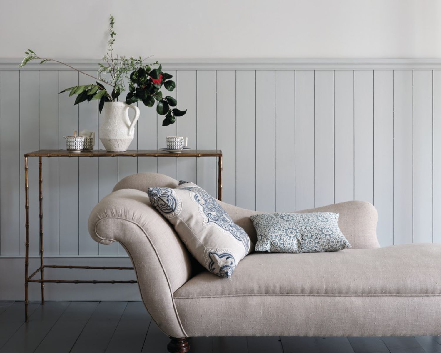
2. Elephant’s Breath No. 229
A warm mid-grey with subtle mauve undertones, Elephant’s Breath is a sophisticated neutral that shifts beautifully in different lights. While it appears as a soft, contemporary grey, its hint of magenta adds warmth, creating an inviting atmosphere. In cooler, west-facing rooms, it takes on a delicate lilac hue, adding depth and interest.
Suited for open-plan living spaces, modern kitchens, and hallways, this versatile shade brings warmth and elegance to any setting. Pair it with Charleston Gray and London Clay for a rich, earthy scheme, or combine it with Strong White for a balanced, calming effect. Loved for its ability to add character while remaining effortlessly neutral, Elephant’s Breath is a timeless choice for both classic and contemporary interiors.

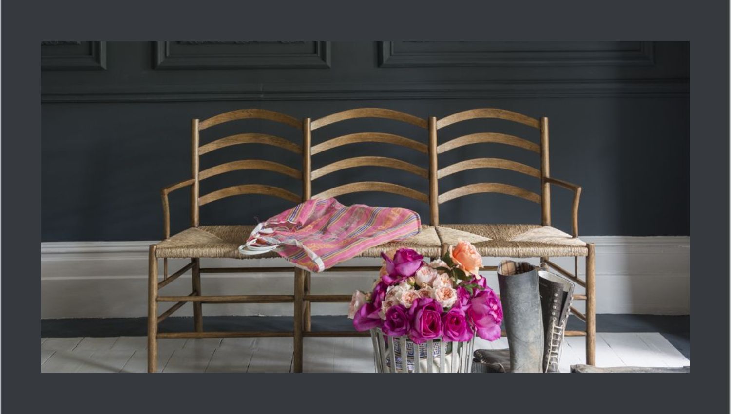
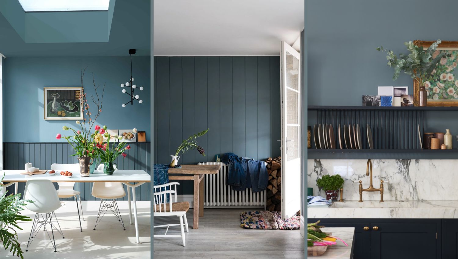
3. Hague Blue No. 30
A deep, dramatic navy with subtle green undertones, Hague Blue brings richness and depth to any space. Inspired by the striking woodwork found in classic Dutch interiors, this timeless shade adds both sophistication and warmth. Its moody, inky tone creates a cocooning effect in smaller rooms while feeling equally at home in grander spaces.
Ideal for dining rooms, bathrooms and libraries, Hague Blue creates an inviting and intimate atmosphere. It also makes a stunning choice for kitchen cabinets, especially when paired with brass or copper accents for a refined contrast. For a harmonious scheme, complement it with Borrowed Light for a soft contrast or embrace its depth with Parma Grey and Lulworth Blue. Loved for its versatility, this bold hue balances elegance with a modern edge.
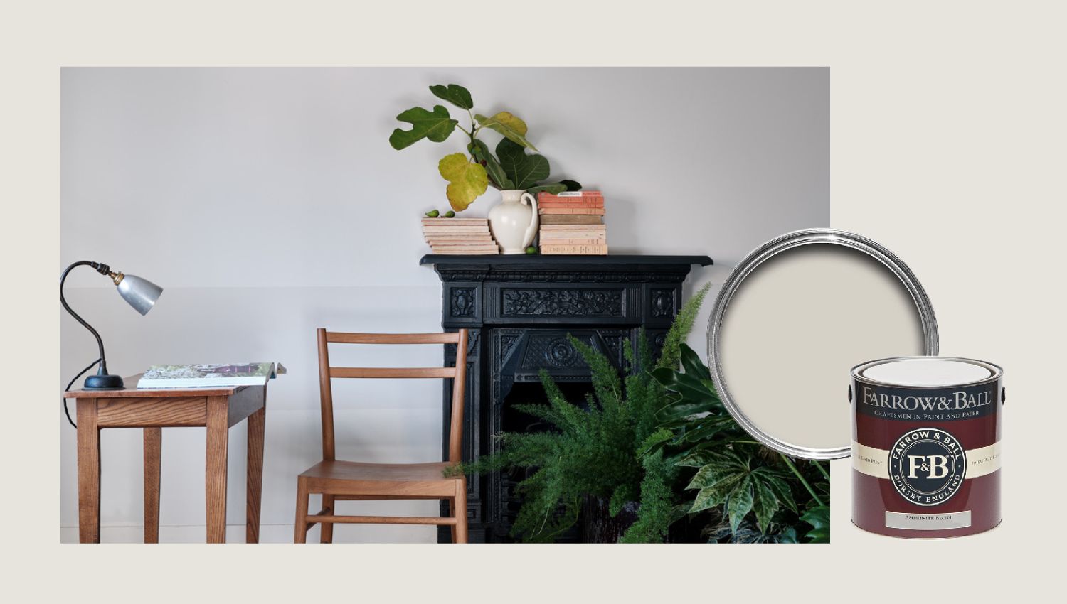
4. Ammonite No. 274
A light, soft grey with a beautifully understated character, Ammonite is inspired by the fossil-rich Dorset coastline. Sitting perfectly between warm and cool tones, this versatile shade creates a serene and balanced atmosphere in any space. Its subtle depth makes it a timeless neutral that feels both fresh and effortless.
Best suited for whole-home colour schemes, north-facing rooms, and contemporary minimalist interiors, Ammonite brings a quiet sophistication to modern and traditional homes alike. Pair it with All White to enhance its airy, light grey feel or Wevet for a seamless, softly layered look. Loved for its adaptability, this gentle hue provides the perfect neutral backdrop for a calm and cohesive interior.
5. Skimming Stone No. 241
A warm, light grey with soft stony undertones, Skimming Stone is an effortlessly versatile neutral. Inspired by both traditional plaster tones and the natural beauty of smooth, weathered stones, this gentle shade brings a sense of calm and sophistication to any space.
Best suited for soothing bedroom schemes, contemporary living areas and elegant hallways, Skimming Stone works beautifully in both modern and classic interiors. Pair it with Strong White for a clean and understated look or introduce deeper shades like Elephant’s Breath, Pelt or London Clay for added depth and contrast. Loved for its subtle warmth and adaptability, this refined neutral creates a serene and inviting atmosphere throughout the home.
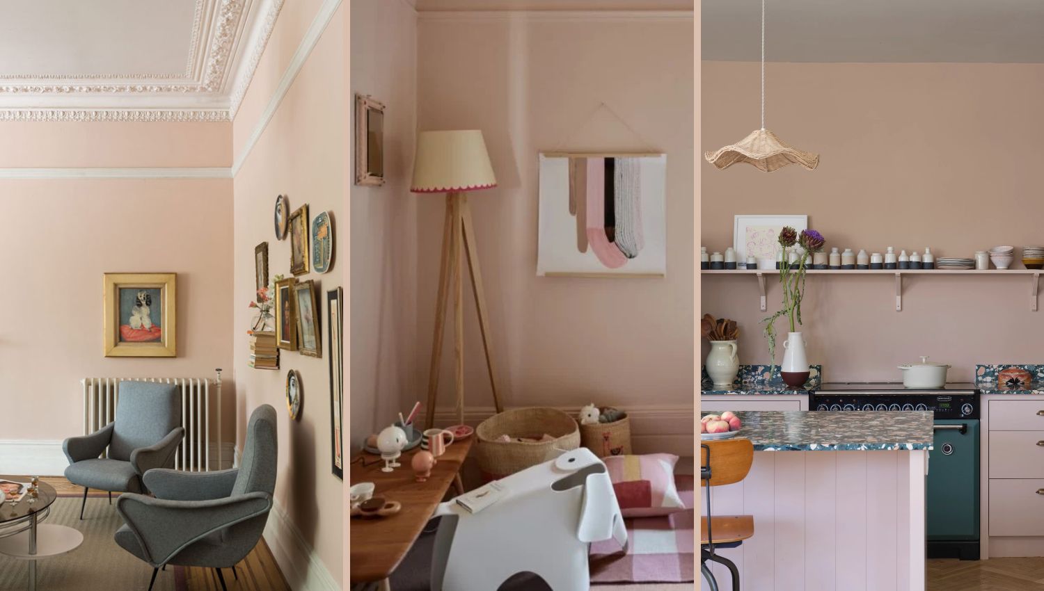
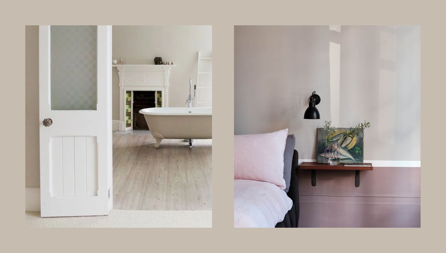
6. Setting Plaster No. 231
A soft, dusty plaster pink with a gentle warmth, Setting Plaster takes its name from the beautifully blushed tones of freshly applied plaster. With subtle yellow undertones, this timeless shade feels delicate yet grounded, making it a refined choice for both classic and contemporary interiors.
Perfect for creating warm, inviting spaces, Setting Plaster works beautifully in bedrooms, living rooms, and dining areas. It provides a stunning backdrop for antique furniture while also complementing modern interiors when paired with deep, rich shades like Mahogany. For a softer contrast, combine it with School House White to enhance its natural elegance. Loved for its understated charm, this muted pink brings a sense of warmth and effortless sophistication to any home.
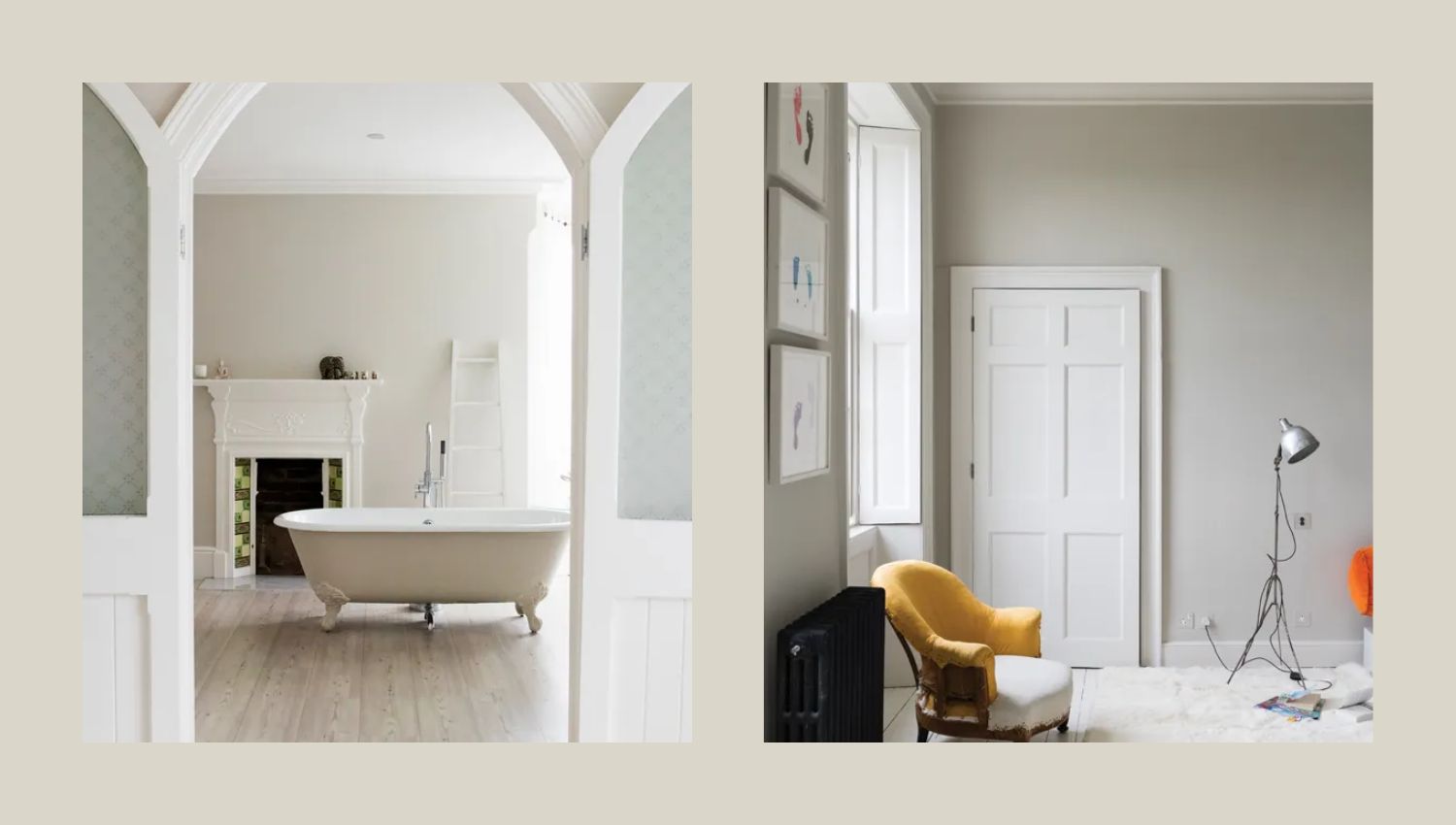
7. Strong White No. 2001
A crisp, grey-based white with a subtle contemporary edge, Strong White is versatile and effortlessly sophisticated. Its cool undertones bring a modern twist to period homes while complementing sleek, minimalist spaces with ease.
Best suited for whole-home schemes, modern kitchens and light-filled living spaces, Strong White creates a fresh yet inviting atmosphere. It pairs seamlessly with Skimming Stone and Elephant’s Breath for a soft, layered neutral look, or with All White for a clean, contemporary finish. Loved for its ability to bridge classic and modern styles, this refined white is a go-to for those seeking a balanced and timeless backdrop.
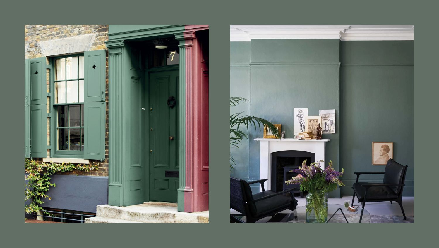
8. Green Smoke No. 47
A deep, smoky green with subtle blue undertones, Green Smoke exudes an inviting and timeless charm. Popular in interiors during the late 19th century, this rich shade has a beautifully weathered quality, making it feel both familiar and sophisticated.
Ideal for creating serene yet dramatic spaces, Green Smoke works wonderfully in studies, dining rooms and cosy living areas. When used on exteriors, it takes on an aged elegance, blending seamlessly with natural surroundings. Pair it with Shaded White or School House White for a balanced contrast, or with Old White and Light Grey for a classic, muted scheme. Loved for its depth and versatility, this heritage-inspired hue brings a sense of calm and character to any setting.
9. De Nimes No. 299
A quietly elegant blue with a grounded, down-to-earth feel, De Nimes takes its inspiration from both Regency-era palettes and the durable workwear fabric first made in the French city of Nîmes. Like denim, this timeless shade is effortlessly stylish yet practical, making it a versatile choice for both classic and contemporary spaces.
Whether used on kitchen islands, cabinetry, or entire rooms, De Nimes brings a sense of depth and sophistication without feeling overpowering. It pairs beautifully with Shaded White for a soft, balanced contrast or with Railings and Hopper’s Head for a moodier, more dramatic scheme. Loved for its ability to feel both refined and relaxed, this rich blue is a perfect blend of tradition and modernity.
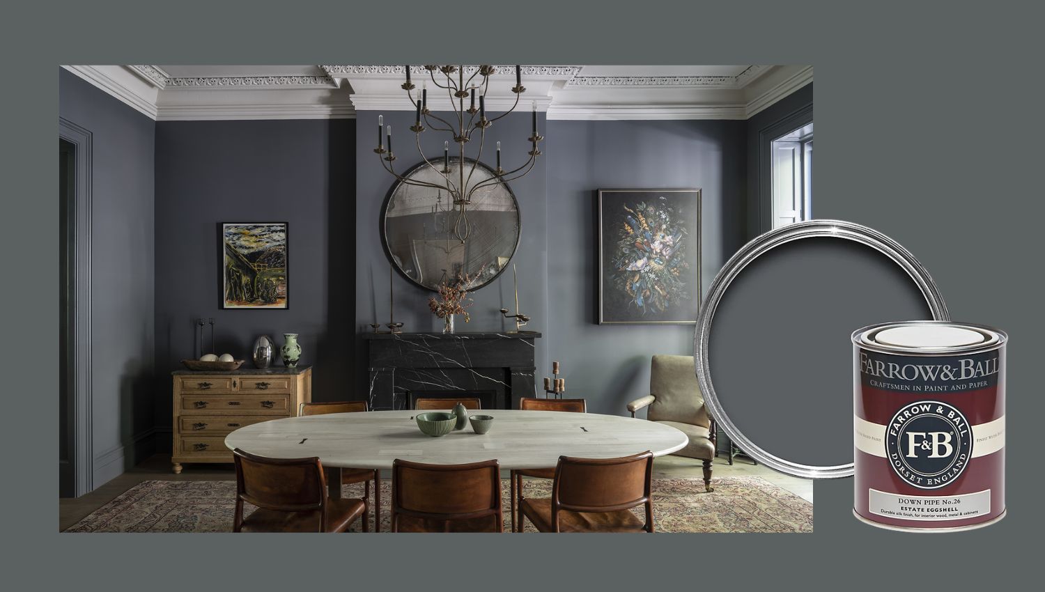
10. Down Pipe No. 26
A deep, dramatic lead grey with striking blue undertones, Down Pipe is a bold and atmospheric shade that adds instant sophistication. Originally inspired by the colour of traditional downpipes and guttering, this rich hue has become a favourite for interiors, offering depth and complexity in any setting.
Ideal for creating moody and dramatic spaces, Down Pipe works beautifully in hallways to make a striking entrance or as a backdrop for artwork, allowing colours to pop against its intense tone. It pairs seamlessly with Blackened for a crisp contrast or with Manor House Grey and Pavilion Grey for a layered, monochromatic scheme. Loved for its ability to transform spaces with elegance and edge, this daring shade brings contemporary drama to both modern and period homes.
How to Choose the Best Farrow and Ball Colour for Your Home
- Consider Natural Light: Warm colours work best in north-facing rooms, while cool tones help balance south-facing spaces.
- Think About Mood: Dark shades create cosy, intimate spaces, while lighter colours feel open and airy.
- Pair with the Right Finishes: Dead Flat offers a chalky, heritage feel, while Modern Emulsion is wipeable and durable for high-traffic areas.
FAQs: Choosing the Right Farrow and Ball Paint Colour
1. What is the most popular Farrow and Ball colour?
Ammonite and Elephant’s Breath are among the best-selling neutral shades, while Hague Blue and Railings are top picks for statement colours.
2. Which Farrow and Ball paint is best for small rooms?
Lighter shades like Strong White, White Tie and Skimming Stone make small rooms feel larger and brighter.
3. How do I know if a colour will suit my home?
Use sample pots and test on different walls throughout the day to see how the shade reacts to changing light.
Conclusion
Farrow and Ball’s timeless, richly pigmented colours provide depth, elegance, and versatility for any space. Whether you prefer neutral tones, bold statement hues or heritage shades, this guide to the most popular Farrow and Ball paint colours will help you make the perfect choice.
Discover the full range of Farrow and Ball paints and find your perfect shade today!